Socioeconomic Indicators and Languages Spoken In Communities in Chicago from 2008-2012
Interactive Scatterplot
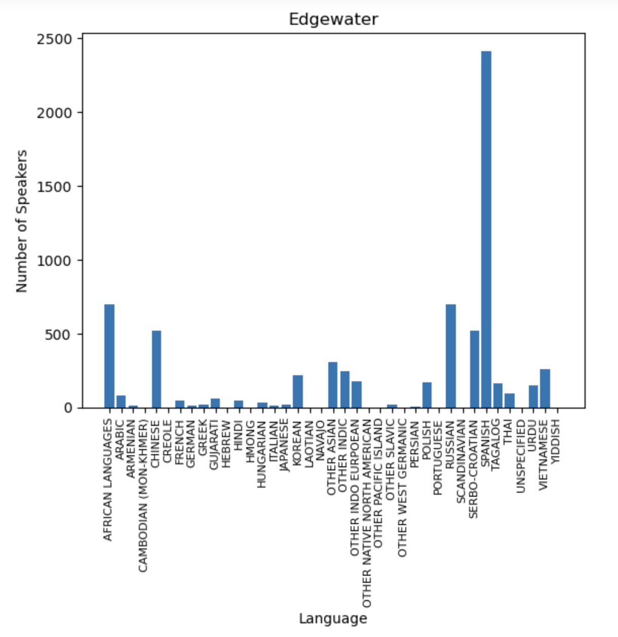
Primary Languages Spoken in the Community of Edgewater
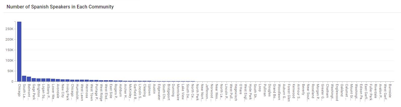
Amount of Spanish Only Speakers in Each Community of Chicago
Write Up
The dataset includes a selection of six socioeconomic indicators in the Chicago community from 2008-2012. The indicators are as follows: the percent of occupied housing units with more than one person per room, the percent of households living below the federal poverty level, the percent of people in the labor force over the age of 16 years that are unemployed, the percent of persons over the age of 25 years without a high school diploma, the percent of the population under 18 or over the age of 64, and per capita income. In the first visualization, we created an interactive visualization to compare the per capita income and the community area name in a scatter plot. The interactivity that we are trying to show is that if we drag and click on the visualization, we can select specific dots (communities) below, delivered in a bar graph that compares their hardship index. A hardship index represents a score that incorporates six different socioeconomic indicators. When clicking on the visualization and creating a box, we could zoom in and out to make the box bigger or smaller to include the communities that can be selected. To make the visualization easier to read and follow, we incorporated different colors so the audience could differentiate between the various communities. In the bar graph, a column to the right is displayed as a key to help the reader further find the exact information they need. With the size of the chart, we decided to make it a little bigger to represent all of the communities and ensure that they were all shown clearly. It may be awkward to find all the data as the audience may need to swipe left or right to see all of the data. To the right of the scatter plot, a heat per capita key is represented where the color blue represents each community's per capita income. With the second dataset we chose, we decided to make a simple non-interactive bar graph that compares the language to the number of speakers. With the size and color of the chart, we decided to do a nice blue color to show a vibrant-looking visualization to attract the audience. Edgewater has a specific hardship index of 19, so they are on the lower end of the spectrum. When looking specifically at the data, we can see that Spanish is dominant in the number of speakers, with over 2000. On the other hand, the languages of Laotian, Yiddish, Persian, etc., don't have any speakers in the area, so people who speak those languages may have a more challenging time communicating with others. In the third visualization, when we look more closely into this visualization, we can see that Edgewater does not even come close when being represented in his graph compared to the grand scheme of Spanish speakers. This may be because of the smaller population residing in Edgewater, but it still holds a small percentage of Spanish speakers. The data shows that with a population of 2.7 million people living in Chicago, it is the number one city with the most Spanish speakers and will continue to grow its numbers in the future.